Raymond Legal is a UK law firm for Chinese businesses and individuals working across the UK and Europe. I am upgrading its brand and designed and built its website.
- Role
- Brand and website
- Years
- August 2026 to now
- Disciplines
- Brand, web design, build
- Status
- Ongoing
01 / Overview
Raymond Legal advises Chinese businesses and individuals across the UK and Europe, from company formation and M&A to immigration, employment and IP. It is regulated by the SRA, recommended by Chambers, and has offices in London, Paris and Dublin.
The brief: look as established as the City firms it competes with, and read just as clearly to a founder in Shanghai as to the other side of the table in London.
02 / Brand
Raymond Legal already had a mark, a red and a typeface. The job was to make them work across everything the firm actually sends out: a website, social posts, a brochure, a deck, cards and a Chinese edition of the guidelines.
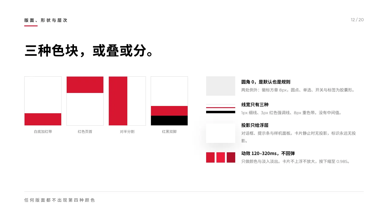
I wrote the rules down as a system, then built the templates on top of it. One red, one black, one typeface, square corners. Chinese text sits beside the English mark as text, at 0.3em tracking, never as a second logo.
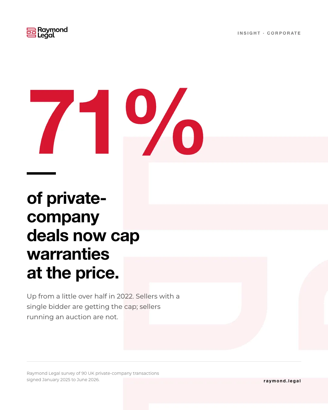
Social
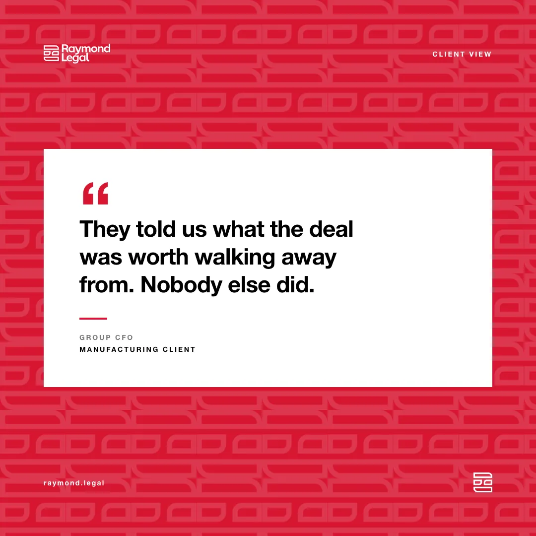
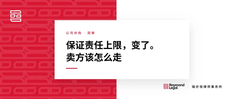
Three formats: an insight post built around one figure, a client quote on the tiled emblem, and a WeChat article cover. The red is the accent; the body text never turns red.
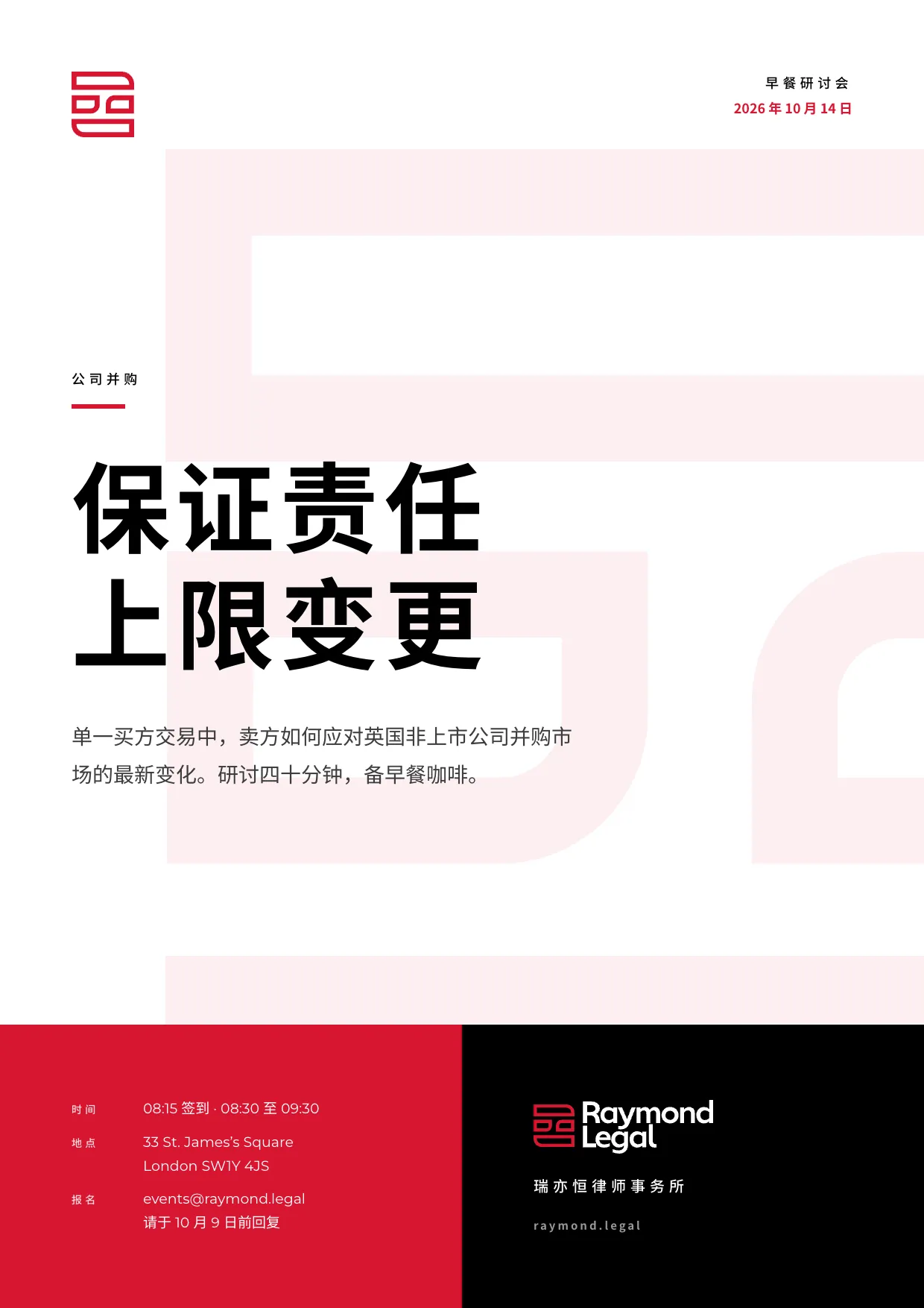
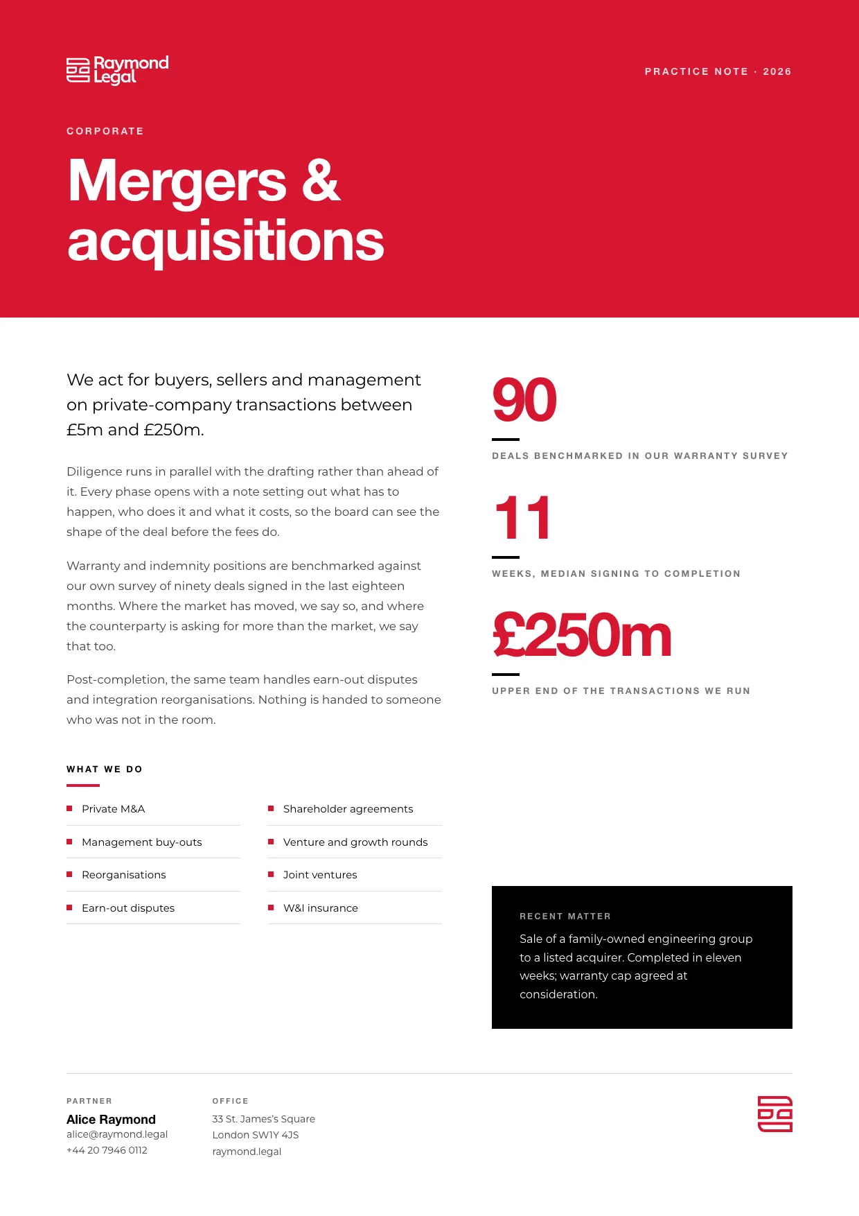
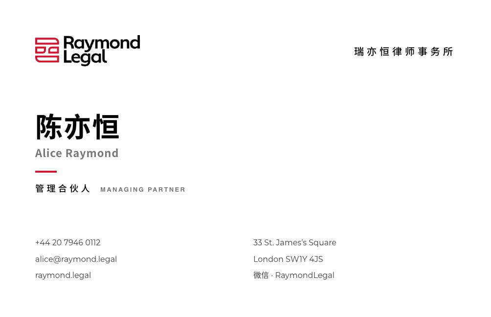
An event poster in the Chinese practice register (four-character headings, no punctuation), a one-page practice fact sheet, and a bilingual business card where the Chinese name leads.
Brand guidelines, in Chinese
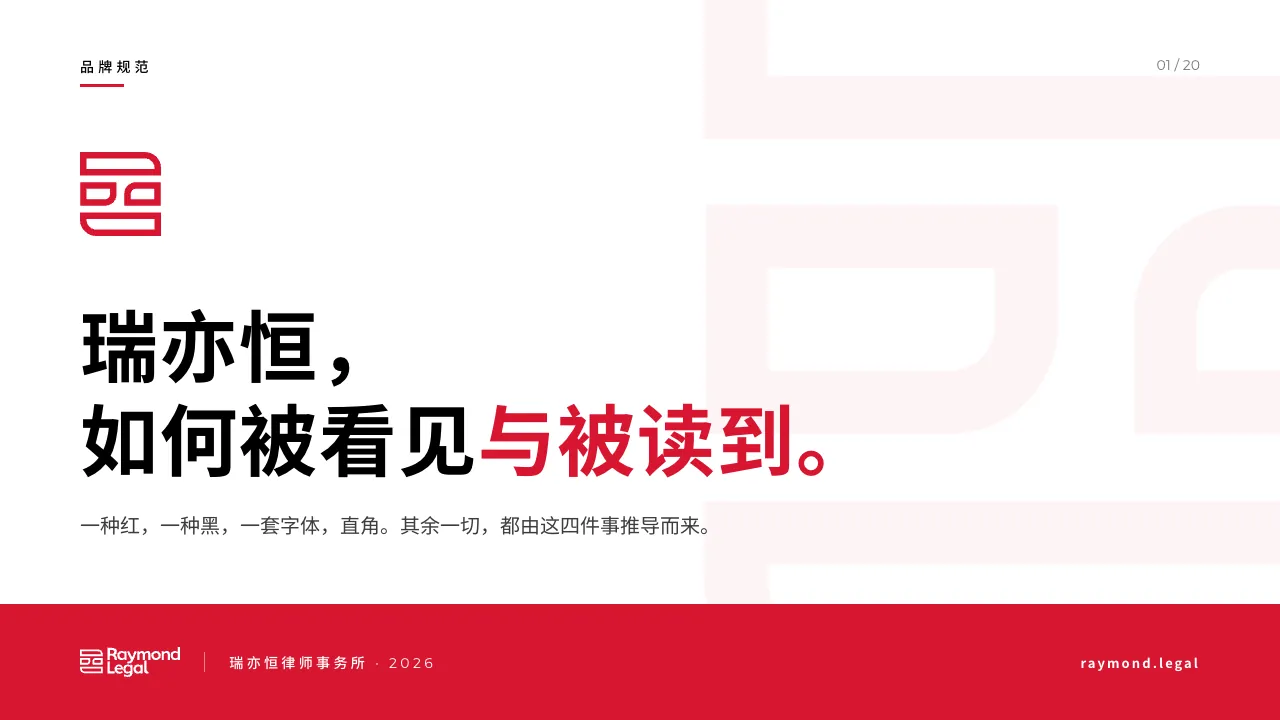
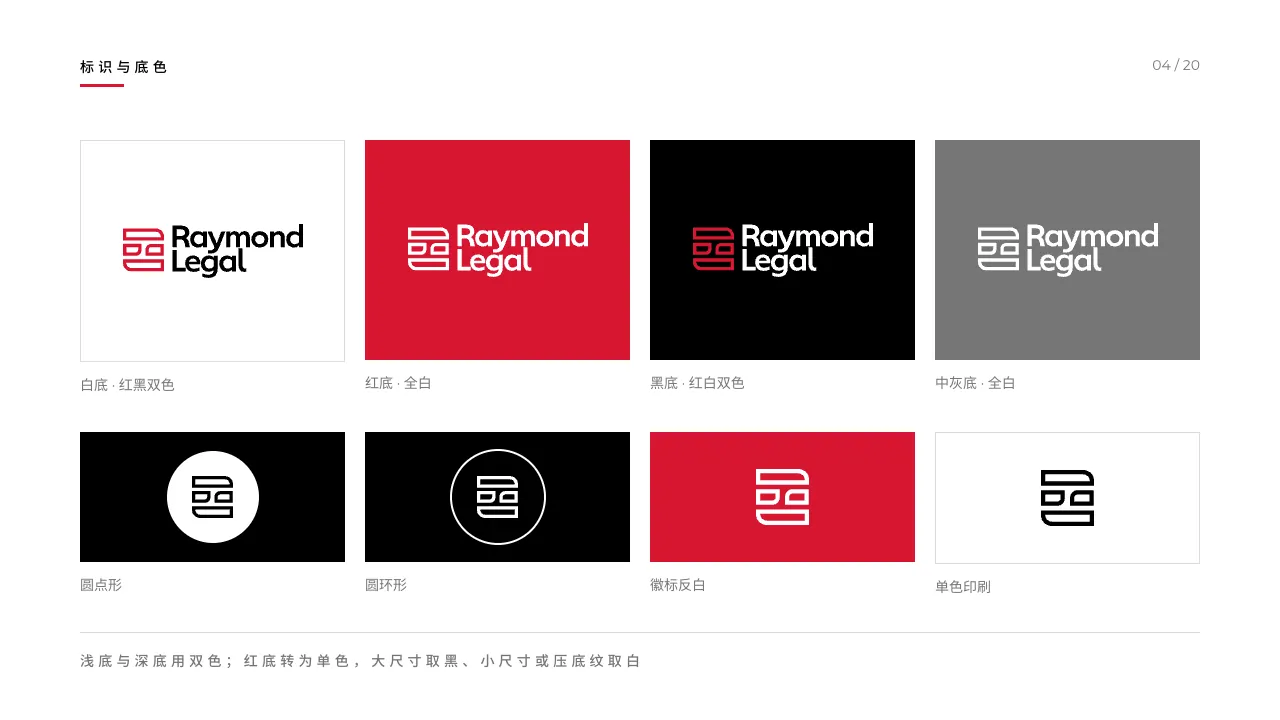
A 20-slide guidelines deck written for the firm’s Chinese partners: the mark, grounds, clear space, type, the three surface structures and misuse. Chinese display type is tracked at 0, never the Latin’s negative tracking, and strings with digits never take the wide tracking.
03 / Website
One site in three languages, organised around the ten practice areas so a client can find the right lawyer in two clicks. Each language has its own pages, not a translation layer.
The home page opens on the three offices, then the practice grid on black, then the sectors the firm knows. The firm’s Chinese name, 瑞亦恒律师事务所, appears as text beside the English mark, never as a second logotype.
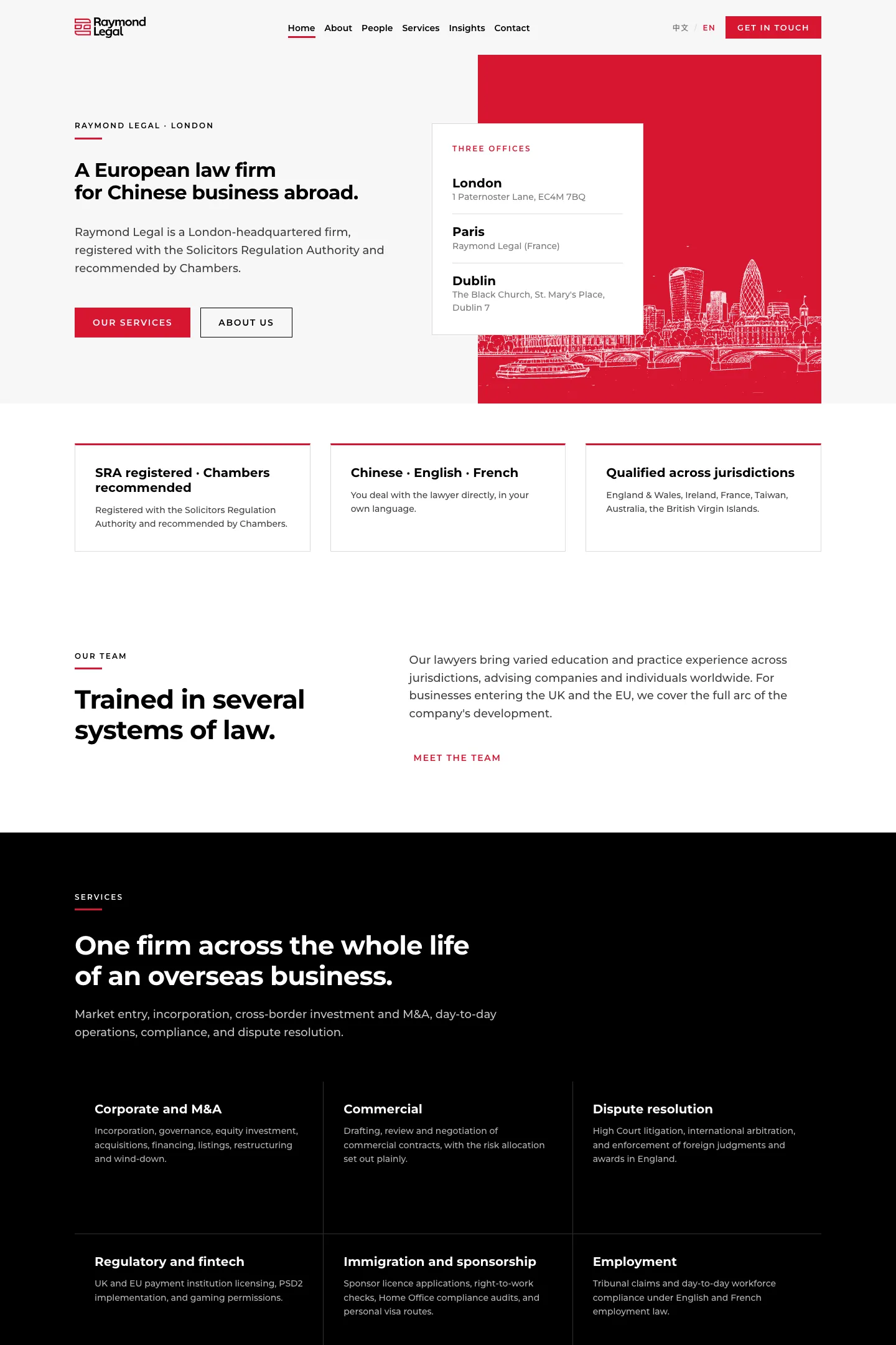
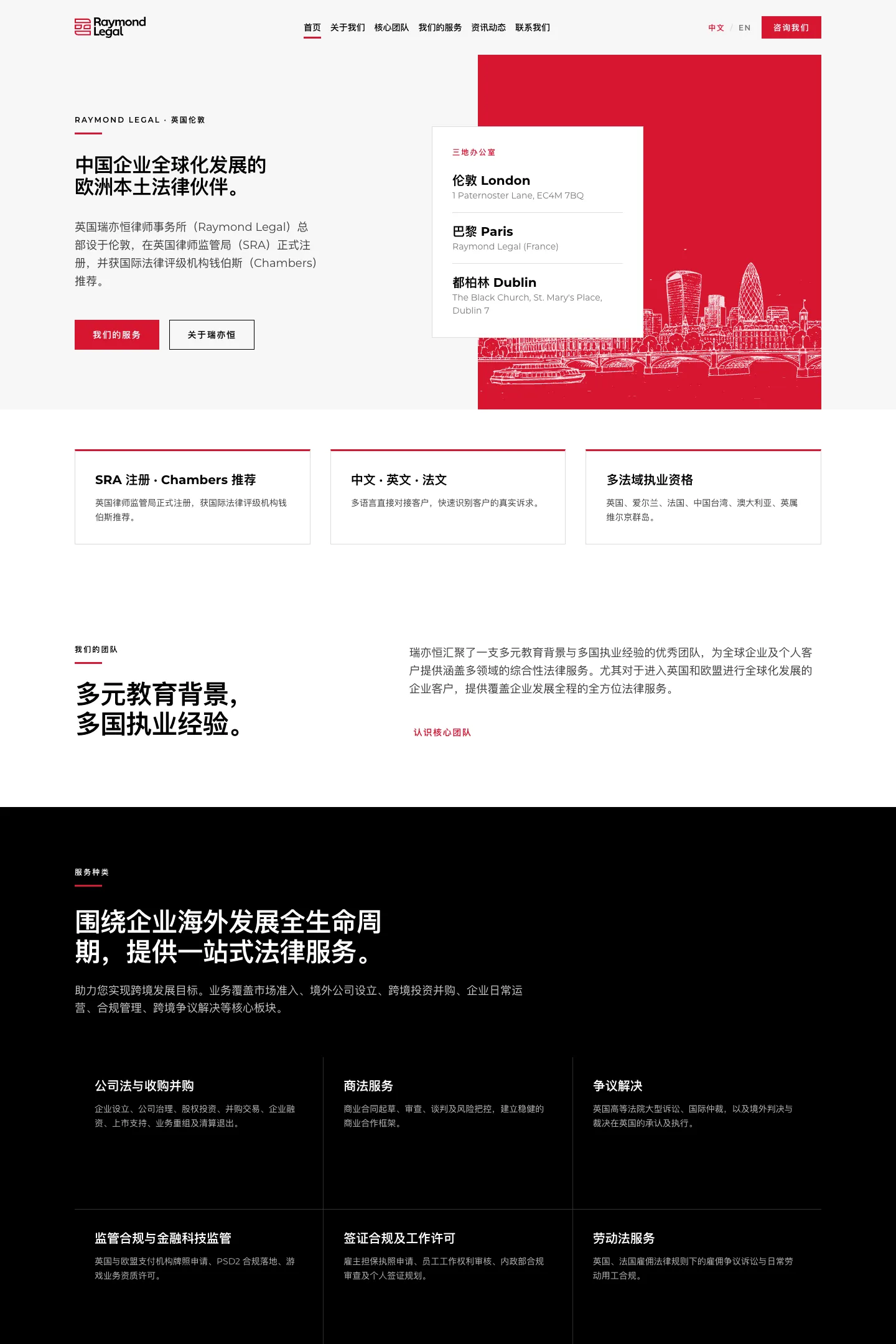
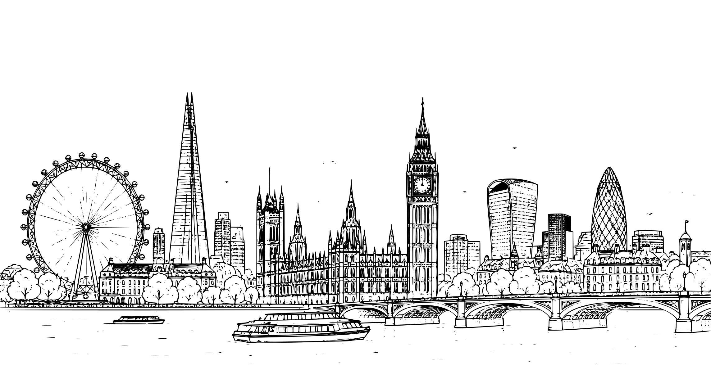
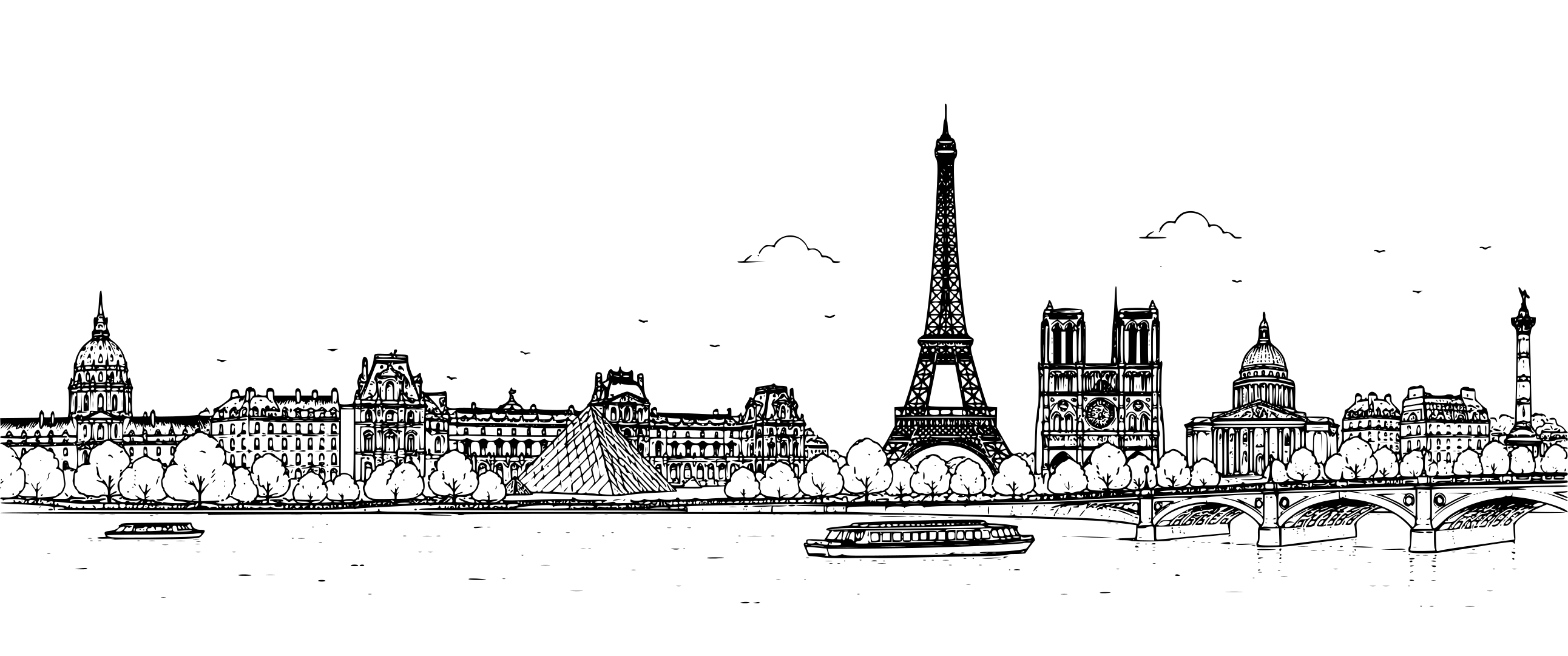
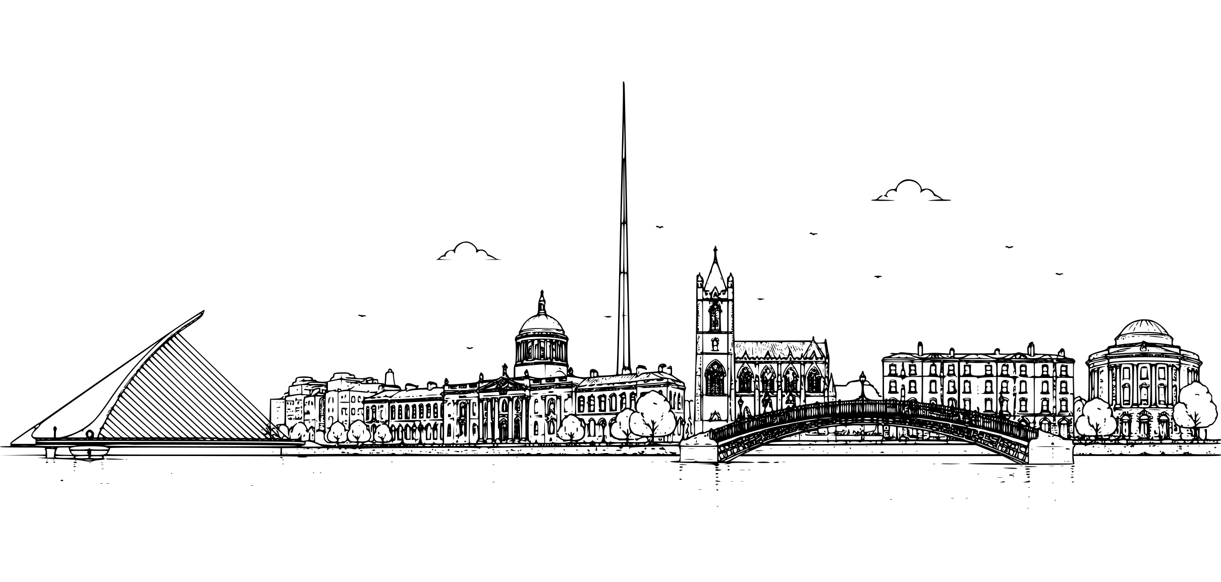
Three offices, three drawings
The client supplied single-weight line drawings of London, Paris and Dublin, one per office. They are the only illustration on the site and sit on the contact and office pages.